

Care in the Moments That Matter
The online claims flow hadn't been meaningfully updated in years. The plan was a design system migration. I saw an opportunity to do more and built the case for it.
Role
UX Design Director
Team
UX Designers · UX Writers · UX Researchers · Product · Business Analysts · Developers
Company
Co-operators
The Situation
Filing a claim is one of the most stressful moments in a client's relationship with their insurer. Something has gone wrong. They need help. The online claims flow was supposed to make that easier. It hadn't been meaningfully updated in years.
The plan on the table was a design system migration. A visual refresh. No change to the experience underneath.
My Role
UX Design Director. I identified the opportunity to go beyond the brief, built the coalition to make it possible, and directed the team on what to fix and why it mattered.
The Approach
The resistance was reasonable. A full overhaul of the online experience was planned within the year. Why invest in the claims flow now?
Because clients were using it now.
I started by aligning with the development director and lead developer, making sure what we wanted to do was actually achievable within the allocated time. With that grounded, the three of us approached product management together. The ask wasn't to blow up the timeline. It was to use the time we already had more deliberately.
We got the scope.
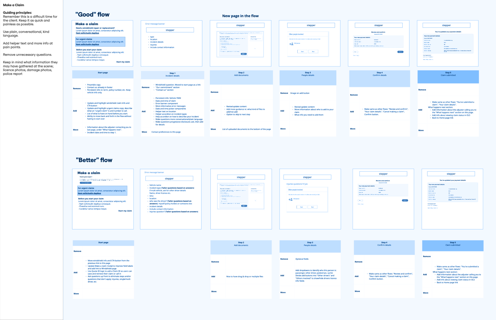
Three things needed fixing. The flow was written in insurance-speak that added confusion at an already anxious moment. Windshield claims had a routing problem. Users would enter the main claims flow without realizing windshield damage was handled separately, ending up confused and calling the help desk. And there was nothing at the end of the flow to tell clients what happened next.
We rewrote the flow in plain language. We fixed the windshield entry point. And we added a confirmation section that told clients exactly what to expect. Typical timelines, when they'd hear back, what the next steps were. Real reassurance at the moment they needed it most.
What Shipped
An updated claims flow with clearer language, fixed routing, and a “What happens next” section at confirmation. Delivered within the original development effort.or clarity with the pricing requirements that had previously complicated the conversation.
What Changed
- Shipped within original development effort with expanded UX scope
- Clearer entry point eliminated the wrong-flow problem for windshield claims
- Plain language and helper text reduced anxiety at high-stakes decision points
- Clients left the flow with clarity about what came next, not uncertainty